
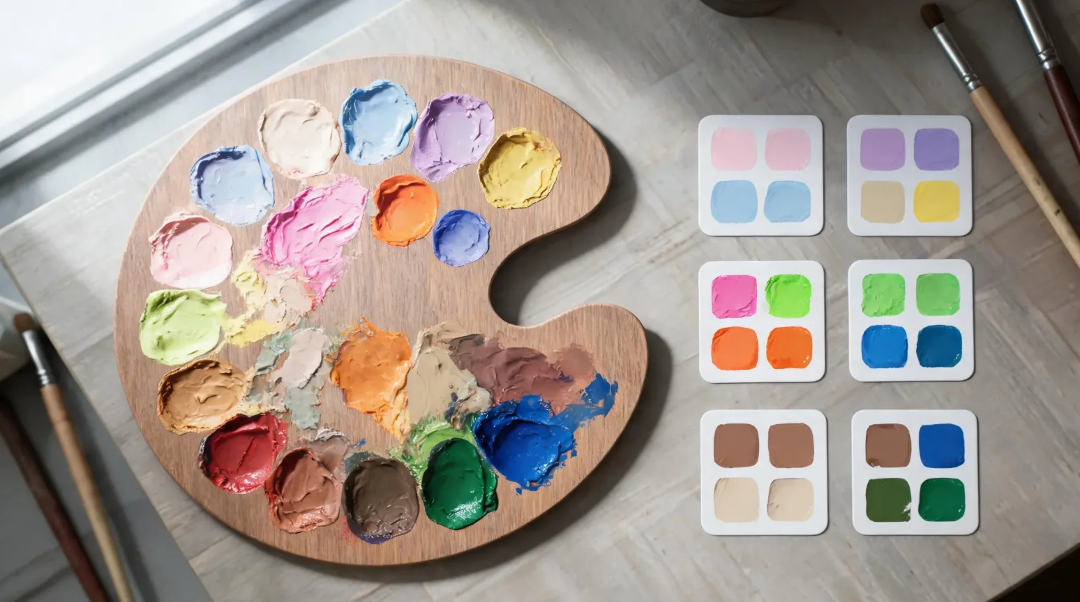
Buyers judge a sticker by its color before they read a single word. The right palette signals who a sticker is for and makes it pop on a screen or shelf; the wrong one makes great art invisible. This is a practical, sell-focused take on sticker color theory — what to use, for whom, and the mistakes that quietly kill sales.
Why color is the first thing buyers notice
In a grid of thumbnails or a wall of stickers, color does the first second of selling. Before the design registers, the eye reacts to hue, contrast, and mood. Color sets the emotional tone, signals the niche (“this is a kawaii sticker” / “this is a gaming sticker”) and determines whether the design even stands out from its background. Get color right and the rest of the design gets a chance to work; get it wrong and the best illustration scrolls right past.
Color psychology basics for sticker design
Colors carry associations buyers feel instantly. Match the palette to the audience, not just to your taste:
| Color family | Emotional association | Best niche fit |
|---|---|---|
| Pastel / soft | Calm, cute, gentle, dreamy | Kawaii, planner & journaling stickers |
| Black / neon | Bold, edgy, energetic, modern | Streetwear, gaming, music |
| Earth tones | Natural, calm, trustworthy, sustainable | Eco, wellness, cottagecore brands |
| Bright primary | Fun, playful, energetic, simple | Kids’ products, toys, education |
| Jewel tones | Premium, rich, confident | Boutique, luxury, art prints |
High-contrast vs low-contrast: which sells better on die-cut stickers?
High contrast usually wins for sales — especially on die-cut stickers viewed as small thumbnails. Strong contrast between the design and its own background (and against the white sticker border) makes the art readable at a glance and punchy in a feed. Low-contrast, tonal palettes can look elegant and on-trend (think muted cottagecore), but they risk disappearing at thumbnail size. If you go low-contrast for aesthetics, add one accent color or a defined outline so the design still separates from the background.
Choosing a palette that matches your niche
- Start from the audience — pick the color family that signals your niche (see the table).
- Limit to 2–4 colors — a tight palette looks intentional and cohesive across a collection.
- Add one accent — a single contrasting pop draws the eye to the focal point.
- Test at thumbnail size — shrink the design; if it still reads, the palette works.
- Stay consistent — a recognizable palette ties your whole shop together (see our 2026 trends for current direction).
Common color mistakes that hurt sticker sales
- Low contrast against the background — pale art on a white sticker vanishes in listings.
- Too many competing colors — a rainbow with no hierarchy looks chaotic and cheap.
- Trend-chasing the wrong niche — neon on a wellness brand confuses the audience.
- Ignoring the white border — a die-cut’s white edge changes how colors read; design for it.
- Screen-only proofing — colors shift from screen to print; check a proof before a big run.
Because screen and print color differ, approving a color proof before bulk printing is the single best way to avoid a costly mismatch — see file basics in our design guide.
Frequently asked questions
How do I choose colors for a sticker design?
Start from your audience’s niche, pick a tight 2–4 color palette in the matching family, add one accent, and test that it still reads at thumbnail size.
What colors sell best on stickers?
It depends on the niche — pastels for kawaii/planner, black/neon for streetwear and gaming, earth tones for eco/wellness, bright primaries for kids — but high contrast generally sells best.
Is high contrast or low contrast better for die-cut stickers?
High contrast usually performs better because it stays readable and punchy at small thumbnail sizes. Low-contrast palettes need an accent or outline to avoid disappearing.
How many colors should a sticker use?
Two to four core colors plus one accent keeps the design cohesive and intentional, especially across a collection.
Why do my printed colors look different from my screen?
Screens emit light (RGB) while print reflects it (CMYK), so colors shift. Approve a printed color proof before a bulk run to be sure.
Not sure about your palette? Send us your design and we’ll proof the colors before you print in bulk.
Buyer Notes for Sticker Color Theory: How to Pick Colors That Actually Sell
For sticker sourcing, buyers should consider product format, finish, carton quantity, packaging style, and whether the design fits the intended retail or promotional use. StickerJaki focuses on carton-based wholesale supply, with standard product orders following MOV $200. Custom sticker pricing depends on the product type, material, finish, packaging, and quantity.
Sticker products can look similar online, but commercial results often depend on details such as adhesive choice, finish, packaging, sheet layout, and carton quantity. Buyers should match those specifications to the selling channel before choosing a product.
Quick sourcing checklist
- Define where and how the sticker will be used
- Compare material, finish, packaging, and carton quantity
- Use custom quoting when standard products do not match the project
For readers comparing options, the best next step is to move from general research to the right product or quote path. Useful resources: Wholesale sticker products · 3D relief stickers wholesale · Custom sticker manufacturing.
If the standard product range does not match the exact design, packaging, or application requirement, a custom quote is usually the better path. In that case, prepare the artwork, expected quantity, target material, finish, and packing method before contacting the supplier.
Commercial Planning Notes
Most sticker decisions become easier when buyers separate appearance from function. Appearance covers artwork style, finish, color, shape, and packaging impression. Function covers adhesive, surface compatibility, durability, carton quantity, and how the product will be handled after delivery. Both sides matter for a successful commercial sticker order.
Before placing a wholesale order, buyers should confirm the selling unit, carton quantity, product dimensions, material expectations, and whether a standard product or custom quote is the right path. This keeps the purchase aligned with retail display, online fulfillment, promotional use, or brand packaging needs.
For buyers comparing multiple sticker formats, the practical next step is to shortlist the intended use first, then match the product format to that use. Standard wholesale items are generally best for fast sourcing and retail assortments, while custom production is better when the design, material, dimensions, or packaging must follow a specific brand requirement.


